Chinoiserie Dining Room
When we bought this house 3 years ago, I knew I'd eventually want to add my own touch to the dining room, but it wasn't a priority. After tackling the master bathroom and basement (still tweaking, but I'll share that soon), pandemic stir-craziness had me starting on light fixtures that I wanted to swap. I had time on my hands and a desire to stop doomscrolling on the internet, so I dove head first – armed with elbow grease – to revamp the dining room.
This involved:
- Removing wallpaper
- Scraping and cleaning the walls
- Patching holes
- Priming with an oil based primer (I went with oil based because if there was any sticky residue left on the walls, it would cover it instead of activate it like a water-based paint would)
- Painting walls
- Having 2 large pieces of furniture moved to other floors of the house
- Changing the chandelier
- Sewing 4 lined curtain panels
- Hanging curtains on a longer rod than previously installed
- Reupholstering 2 chair cushions
- Adding new chairs
- Adding a china cabinet
- Making an old console table into something functional, but not unsightly
- Repairing table top
- Printing, framing, and hanging art
- Adding place settings
- A little tabletop decor
I'm tired just typing that out! Steve will attest that when I start something, I become super stubborn until I finish it. He repeatedly asked why I was wearing myself out to do this, but I hate incomplete projects. Start-to-finish this took 4 weekends. I'm thrilled with the results!
I'm not going to make this blog post longer than it already is with a ton of detail about each step, but if you have questions please feel free to ask and I'm happy to share. If you want to watch the entire process, you can visit my Instagram profile and select the "Dining Room" Story.
The Inspiration
I love color and Chinoiserie, blue and white china, and Hollywood Regency style. Yet, I wasn't sure if I could commit to the color explosions and print mixing that inspired me. I also didn't want to buy all of the items that I thought I'd need to really properly accessorize a maximalist space to seem complete. There are definitely more accessories I'll eventually add, like different centerpieces, a table runner, and perhaps a mirror or two. I'm happy with how things are now, though! (You can see some of the things I like on this Pinterest board.)
The room is open to my formal living room, where I went with a couple of large statements, but still fairly transitional with a neutral base and nothing I couldn't quickly swap out or undo.
Before: Very traditional hodgepodge dining room
When we bought this house, we also bought the dining room table and chairs from the previous homeowner as we didn't have anything that fit the space and had a lot more pressing furniture needs before we'd get to it. It was a hodgepodge of their old furniture, plus a wine buffet from my old house and an antique dresser (of all things) from Steve's house.

There's nothing really wrong with the room. It is functional and we hosted Thanksgiving and also our rehearsal dinner here. But, it didn't really feel like the rest of the house – fairly airy with pops of color.

On more than one occasion, visitors to our house remarked how the room reminded them of Beauty and The Beast. I'm guessing it's the traditional walls, long table, and large chandelier?

There were 6 skirted parsons chairs and 2 end chairs with arms. The end chairs were really good quality. Unfortunately, we had multiple of the upholstered ones break on us. The last thing I wanted was to have a visitor over and have a chair break.

We moved my wine server/buffet downstairs to the basement near the bar, and the dresser up to a guest bedroom. The unbroken skirted chairs were donated.
Disclosure: This post contains affiliate links. If you click through a link and make a purchase, I'll receive a small commission at no additional charge to you. This helps me cover the upkeep costs associated with keeping this site running.
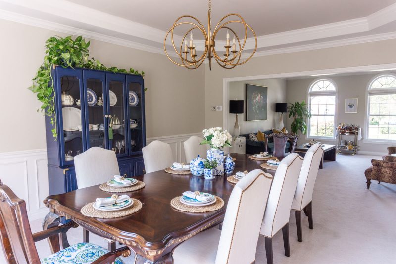
After: Chinoiserie-lite dining room with blue and green accents
I wish I was better at interior photography because I couldn't seem to capture how bright the space feels. I'll keep practicing!

I've eyed this Gabby Decor chandelier for about a year, thinking I might use it in my entry. When it came to find a light for this space, I wanted something that made a statement, but wasn't overwhelming and heavy. This light came to mind, and it was on sale for 25% off so I grabbed it. I love it so much. Tip if you're searching for Gabby lights – price check multiple sites, including the official Summer Classics website. When I purchased it, there was about a $300 price difference between that and One Kings Lane. The estimated delivery timelines can vary greatly also.
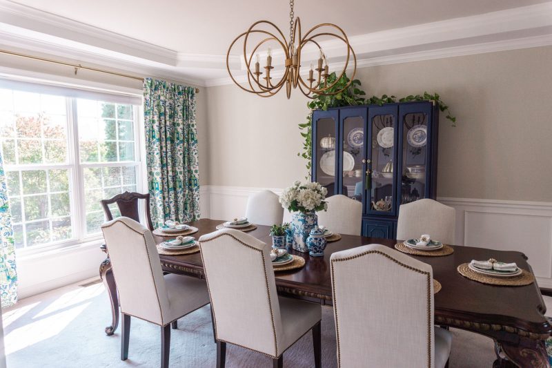

This blue cabinet is really what set me in motion on this project. I saw it pop up on the Instagram page of a local vintage shop, Fleur de Flea. It was my favorite color, the right dimensions, and only $250! It's from the Zig and Company booth – you should check her out on Instagram if you love colorful design.


These curtains were a labor of love, and I'm very proud of them! I ordered several fabric swatches from Ballard Designs. One of them was called Pagoda Green, and I loved the green and blue combo. Little problem? To get 4 panels made of this fabric with a standard rod pocket, it would cost around $1,300. I wanted back tabs, so the thought of paying that much for something that wasn't quite what I was looking for – no! I thought, perhaps I'll just purchase the fabric from them and try to make them myself as they sell yardage as well. It was $45/yard, and I needed 14 yards. Still, $630…
So I started searching on Etsy for people who make custom curtains with similar colors, and found a couple of people selling what appeared to be the exact same fabric, but it was called Richloom Teahouse. Turns out that what I thought was a Ballard exclusive fabric isn't, and it's available many places. I found a great seller on eBay and scored my 14 yards at $14.99/yard! I saved over $1,000 by buying the fabric elsewhere and making them myself.
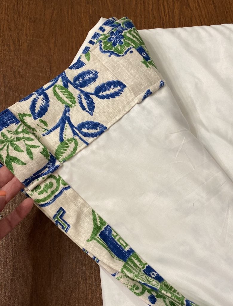
This is the tutorial I used. If you can measure, pin, iron, and sew a straight line, you can sew these. They are fully lined – I used king flat sheets instead of drapery lining. 1 king sheet made 2 panel linings. I have 4 panels total.
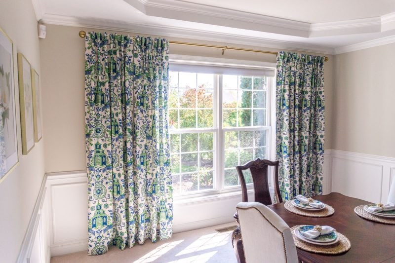
Curtain Rod
Curtain Finials
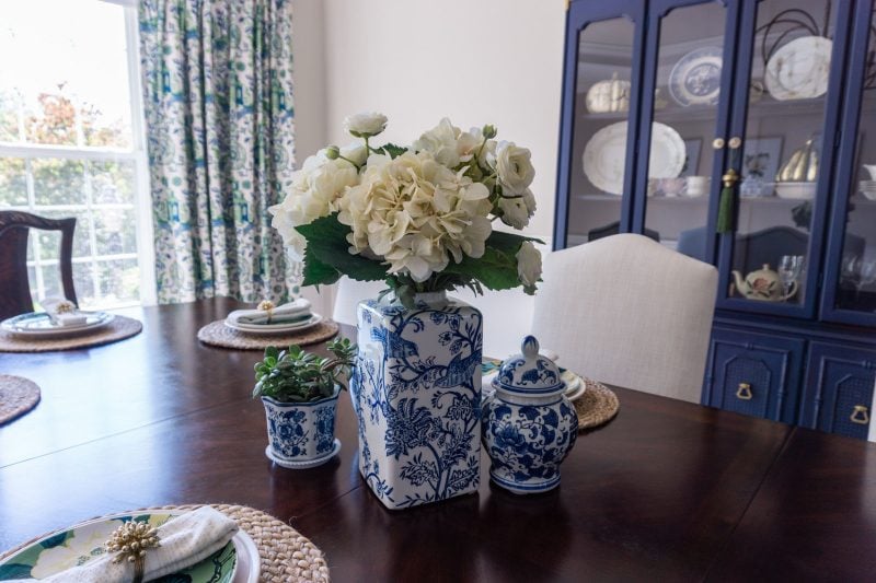

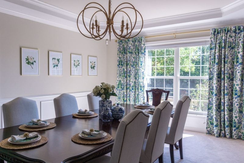
The four magnolia art prints are a budget solution and I'm really happy with how they turned out. I ordered digital prints from WhiteVista on Etsy and had them printed through Mpix. I then put them in some inexpensive Target frames. For those of you who are going to point out the design guideline of the "rule of 3s," I already know about it. But, my house, my rules, and I like the set of 4.

I'll eventually add more to the center of this table, but for now I'm good with a little grouping of blue and white jars I already had.


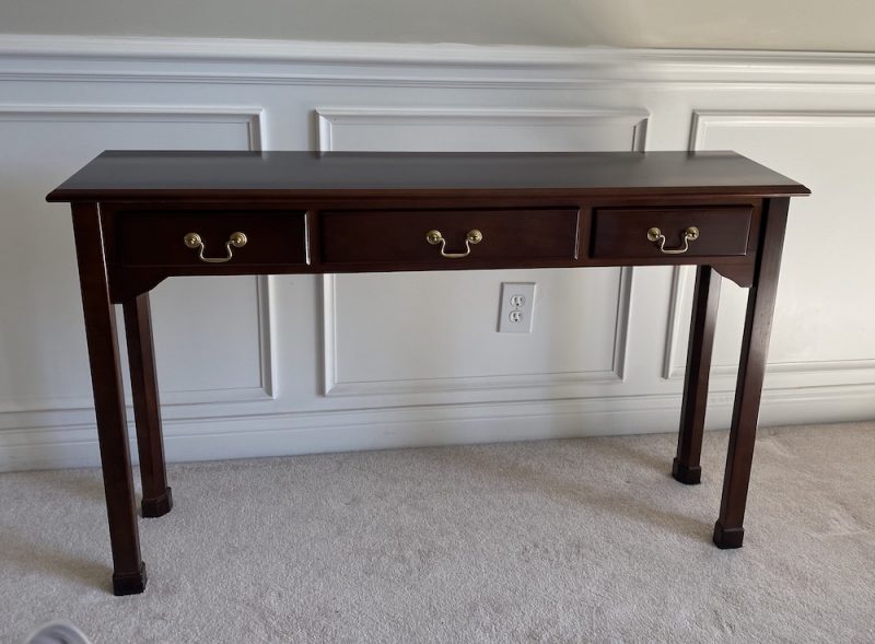
Console table: I wanted a buffet of some sort for functional purposes of setting dessert or drinks, ice buckets, etc, but didn't want to spend any more money, and also was dealing with a narrow amount of space between the chairs and the wall. I had an old narrow console table in basement storage, so I pulled that out and turned it into a skirted table using a linen tablecloth and a strip of fabric left over from my curtain yardage. It Velcro's to wrap around the sides and back of the table so it looks tailored. I then had a piece of tempered glass cut to fit the top. It's narrow and unobtrusive and will serve its function. As a bonus, I'm able to hide a couple of very large serving trays that wouldn't fit in our new cabinet under the skirt!
This is the table without the cloth:
Chairs: I really didn't want to invest in chairs that would easily break. There's far too much "disposable" furniture. I found a brand online based in Hickory, NC and saw that they had hundreds of fabric and trim options… plus the highest weight limit I saw anywhere. I was shocked to see that the prices were as low as they were for such high quality, custom made pieces. These are the Durham Dining Chair from Carrington Court Direct. I went with dark walnut finish legs to match the table, Angela cream fabric and french natural nailhead trim. They have free samples of fabrics and trims, and that really helped me decide on those selections.
Side Chairs: I wanted to keep the side chairs as they are solidly made and match the table. Once the new upholstered chairs arrived, the gold seats of the side chairs looked bright yellow. I had a little bit of extra curtain fabric, so I used it to reupholster the seats:

Phew! I know this was a long one, friends – thanks for being here! Let me know if I left anything out.

Source List:
- Wall color: Benjamin Moore Edgecomb Gray – highly recommend the Aura paint, great coverage
- Light fixture: Gabby Alta chandelier
- Chairs: Carrington Court Direct. Durham Dining Chair, dark walnut finish, Angela Cream fabric with French Natural nailhead trim
- Curtain fabric: Richloom Teahouse, available at many online retailers. I purchased from eBay seller fabric-fabric-fabric. Available as Pagoda Green at Ballard Designs.
- Curtain lining: Amazon (a king sized sheet made 2 panel linings)
- Curtain rod and finials: Pottery Barn
- Cabinet: Zig & Company booth from Fleur de Flea
- Tassel on cabinet: SmithHönig
- Pictures (digital prints) from WhiteVista on Etsy
- Picture frames for art: Target
- Pictures printed at Mpix
- Console tablecloth: Target tabletcloth + leftover fabric from curtains + Velcro
- Jute chargers: Target
- Dinner plates: Kate Spade
- Salad plates: Schumacher for William-Sonoma. They're on deep clearance right now and I'm kicking myself that I could have saved more than I did when I thought I got a good deal on them. Williams-Sonoma won't price adjust, FYI.
- Plate stands: Amazon
- Blue and white planter pots, set of 3: Amazon

Thank you to all of you who took the journey and daily updates from me on Instagram Stories! I got so much feedback as I went through the process that was really helpful.
Source: https://authenticallyemmie.com/2020/10/chinoiserie-dining-room-reveal/

Tidak ada komentar: